Art director Alistair Hanson describes how the latest Printed Pages magazine came together
As It’s Nice That’s printed component, Printed Pages is a biannual magazine serving up the website’s best and most inspiring creative work from the last six months. First published in 2009 under the same name as its online counterpart, it was reborn with its current title in 2013, and is now in its 14th edition. Produced by a team that spans creative and editorial, the issue’s 240 pages were put together with help from emerging designer Georgia Cranstoun, overseen by It’s Nice That art director Alistair Hanson, alongside editor Owen Pritchard. We talk to Alistair about how the design process unfolds – from kick-off meetings and photographic commissions, to concepting a boundary-pushing cover with a life of its own, by Venezuelan animator and illustrator Igor Bastidas.
Overview
Since Printed Pages serves as a compendium of It’s Nice That’s best content, the process of putting it together is kind of never-ending, in that we’ll be publishing online content all the time. But we officially start working on each issue around two months before we go to print. We’ll begin by selecting work weve featured on the site, as well as commissioning original features; then we go into full-time design and production mode about four or five weeks beforehand – commissioning artwork, working on the cover, designing the layout and going through the iterations of that process.
For this issue, I served as the overseeing art director, predominantly focusing on the commissioning for the cover and the collateral [stickers, postcards and a poster within the magazine]. Together with [junior art director] Connor Campbell, I also worked on the photography and illustration to go with the features. For anything editorial, I’ll always be in direct contact with the editor, Owen, and he brings in his team to get their thoughts on things.

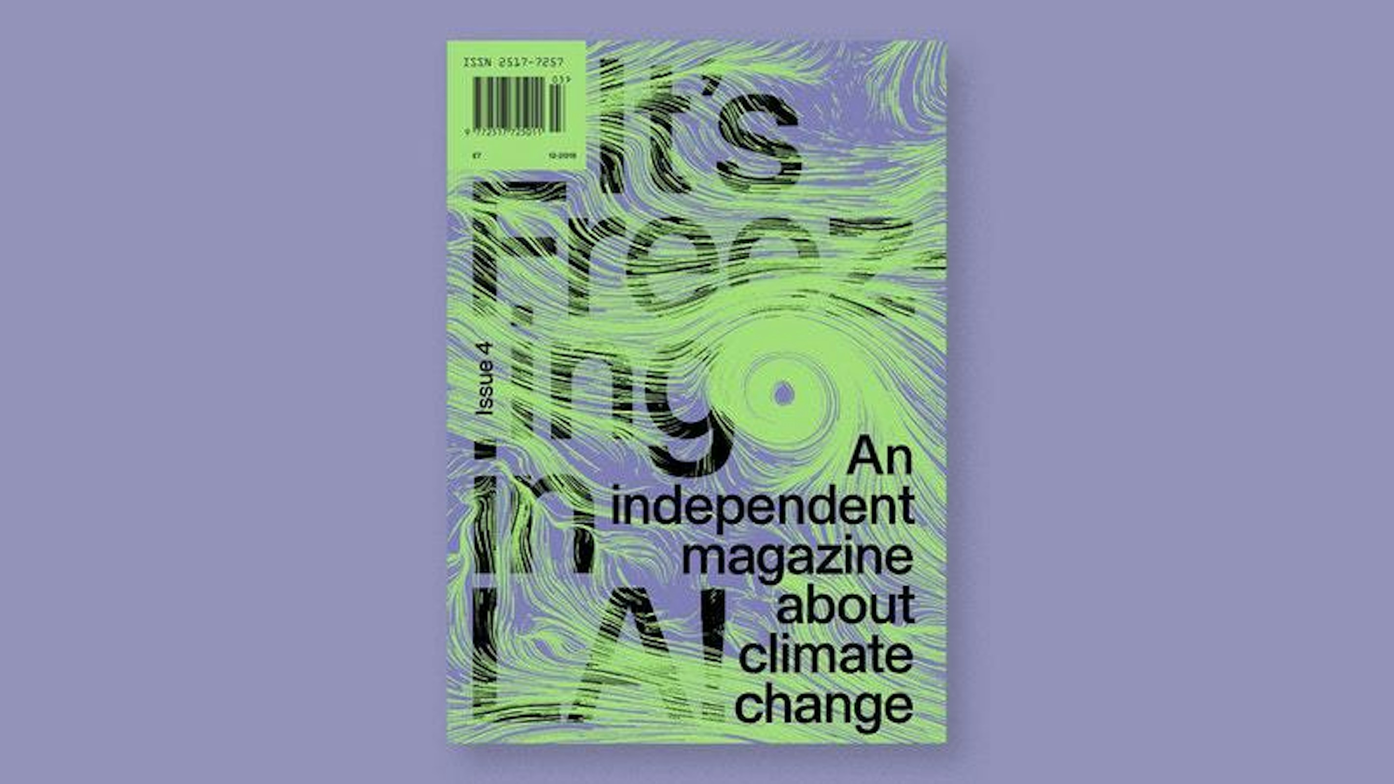
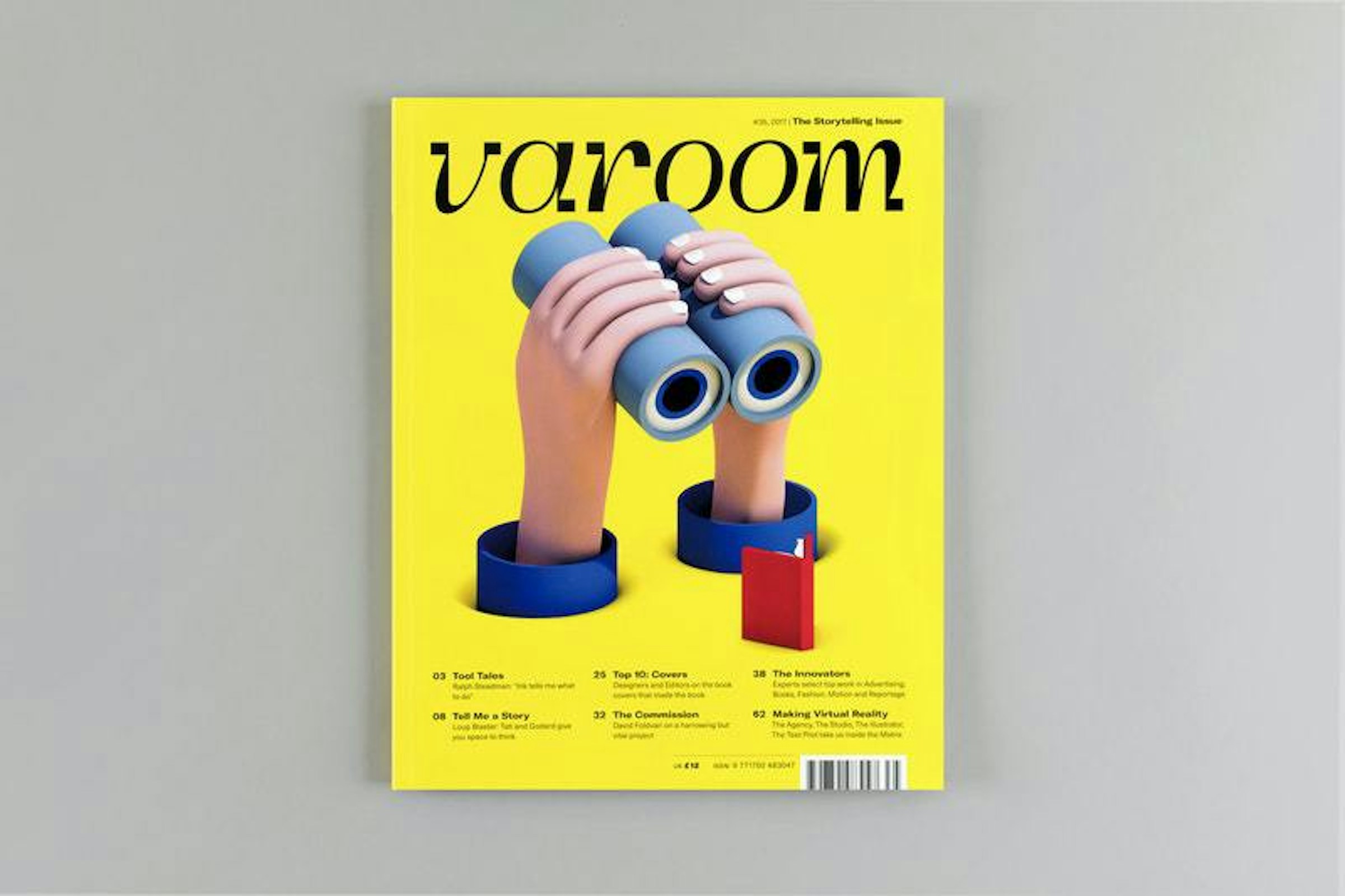
Past issues of Printed Pages

Past issues of Printed Pages and the It’s Nice That Annual

Past issues of Printed Pages

Past issues of Printed Pages and the It’s Nice That Annual
For this edition we brought in freelance designer Georgia Cranstoun, who was an It’s Nice That Grad in 2016. Even though she didn’t have much experience with it, she had expressed a real interest in magazines, so it was a great opportunity to work with someone talented who was really into it. She started working on it from the first week of the design process until the end, and pretty much designed every page.
Georgia started on the design once we worked out a rough running order, and was here full-time for four or five weeks. We have a big cork board we use as a flat plan, and we pin up all the pages in a specific pagination. Here we work out where we want each of our sections to go – from our cover story to our ten features.
Cover design, commissions and layout design all kind of comes all at the same time. I’ve worked on magazines in the past where the cover dictates everything and leads the theme of the issue, but with Printed Pages, we wanted to create a solid design language so we can use any kind of cover, and it will still work.
“Cover design, commissions and layout design all comes all at the same time.”

Planning running order

Selecting content

Planning running order
Developing the Cover
For the cover, we really need to get that nailed early on. It’s such a big undertaking and it takes so long to get it just right. We try to do something different each time, but we always use it as a way to communicate the tone of It’s Nice That. We’re usually within a six-week window, and it starts with developing a brief. For this issue, we wanted to do that with someone whose work we’d featured, to celebrate what they do.
In terms of research and finding inspiration, I’m always looking at magazines, but when I’m working on Printed Pages I find it really distracting to look at any other publications. I either get worried that what we’re doing might not be good enough, or that it might start to look like another magazine. It’s amazing how easily you can be subliminally influenced by anything around you. So it’s really just about what the It’s Nice That tone should be and feel like.

We chose to work with Igor Bastidas, an illustrator from Caracas, Venezuela, but now based in Brooklyn. Though he’s worked on editorial stuff, I don’t think he’d ever done a magazine cover before, but had worked for clients like Cartoon Network and MTV. We really wanted to focus on his exuberant, youthful energy, ’90s-style pop culture references and surreal elements. I was thinking about how to get all of that into a cover, and visually play with the format. With this idea of the surreal in mind, I was keen for him to create a character that actually physically made an impact on the page – like he somehow fell into the magazine.
“When I’m working on Printed Pages I find it distracting to look at other publications. It’s amazing how easily you can be influenced by anything around you.”
Igor’s a big animator, so Connor had the idea of animating the cover to get people’s attention when we promoted it online. We ended up making it part of the character’s story – he lands on the page, then goes on a playful journey through the magazine, jumping into a magazine-shaped pool, and finally climbs out of the pages.
For the cover design, there are usually two or three rounds of amends. In this case Igor was amazing; he nailed it from the start. It took two rounds of sketches to nail the character, then from there it was just applying the colour. He sent through options, and then from there we just landed on a combination we were happy with.

Layout and Page Design
The framework, typography and design language is already in place, but within that there is room for the designer to add their own personality and bring something new to it. I think you need to be able to give the designer room to play, otherwise they don't enjoy the process. It was Georgia’s job to push and break the template a little – exploring things like the opening pages and titles of features, sizing or positioning of imagery and running order.
“I think you need to be able to give the designer room to play, otherwise they don’t enjoy the process.”
I guess I serve as an overseer, a second opinion. Ultimately I’ve got a wider picture of what we’re looking to achieve in the magazine at a more holistic level. Whereas, Georgia is looking more at the detail. It’s good for me to look at it with a fresh pair of eyes; we’ll have daily catch-ups every day or two days.
We go through a new iteration of the magazine every single day. As we go through the pages, we look at these big A3 white sheets and draw out each spread for each story we want to feedback on. We’ll draw out the spread with markers and write, ‘Try this image smaller here, or try a pull quote here.’ Georgia will take all of that on and the next day work on a new iteration.

We’ll also sit down with Georgia and go through printed sheets of spreads. That's super-important; there's no point looking at the design of something printed if you're not looking at it to scale printed out – you can't get a feel for it. We use a hell of a lot of paper here in those few weeks!
About two or three weeks down the line, we'll have five or six features tied up. Then in the final week we'll just be looking at those three or four trickier features and get into the nitty gritty of those. Sometimes we just throw out a whole approach and start again; it's important to be able to have that flexibility and do that.

Commissioning Photography and Illustration
Part of an art director’s job is to know who's right for certain things, to get the right tone. Without that, you don't know if they're going to capture the worth of the subject. A big learning for me since working here has been to really hone in and choose the right people for the right job.
Illustration in the issue includes work for a story on Paola Antonelli, by Barcelona-based artist Mariano Pascual. The article is about Paola working at the MoMA, and their archives – things that can be quite intangible, like the @ symbol, emoticons, Tetris, computer games. Connor had the idea to make these things tangible and feel like museum pieces. He worked on the concepts for each illustration himself, making up a cabinet of curiosities. Mariano absolutely smashed it – I think it’s a real highlight of this issue.
“Part of an art director’s job is to know who's right for certain things, to get the right tone.”

Illustrations by Mariano Pascual

Illustrations by Mariano Pascual

Illustrations by Mariano Pascual

Illustrations by Mariano Pascual

I also really like the tip-in pages we created for the two opinion pieces. One is by Andrew Savage – the lead singer of the band Parquet Courts. He does a lot of the band’s artwork, but he's not really a commissioned illustrator, so I think this is the first commissioned piece of work he's done for anyone. He was really happy to do it, and he created these amazing faces.
Then photography-wise, we have a feature on artist David Shrigley, who was interviewed at a football match with Whitehawk FC. We commissioned Liam Hart, who was again one of our graduates from 2016. We knew Liam was really interested and engaged in fine art (he shot Tim Noble and Sue Webster for us in the previous issue) so we felt he'd be right for it. He did an amazing job of being a fly on the wall, but also capturing people in a very real, and honest way.

Photography by Liam Hart

Photography by Liam Hart

Photography by Liam Hart

Photography by Liam Hart
Sending to Print
Once everything’s designed, there is so much to look at and make sure it’s correct before it actually goes to the printers. On the last day or two I worked with Georgia to package all of the InDesign files up for print. The files are packaged into about four sections in a big folder with all the links, and sent as a huge transfer to the printer. They then look at all the imagery, making sure it's all high-res, and that the colours are all matching properly.
We’re all human beings, so they miss things, and we miss things. So the printer will then print out these big, beautiful proofs that they send back to us. Then we look through and mark up every single page that needs a correction – usually it's around 50. It could be a big error like a low-res image or a widow. We amend these and then send the final to print.
“You always want to improve what you’re working on and keep pushing it forward.”


Delivery
I feel very positive about how this issue came out. For me I get excited about the creative output, and I have my own sense of how good it is. I feel really glad that we pushed for an animated cover. It’s always great to innovate in everything we do, even if it's just a small thing, and champion an up-and-coming creative like Igor.
But ultimately it's about how people react to it. We're still in the midst of that now so it's kind of hard to reflect on it. I get satisfaction if we sell out of the issue, and if I see it on people's bookshelves and in shop windows. The challenge is to meet standards you set previously with each issue; you always want to improve what you’re working on and keep pushing it forward.


Written by Indi Davies
Mention Alistair Hanson
Mention Owen Pritchard
Mention Georgia Cranstoun
Mention Connor Campbell
Mention It's Nice That
Mention Printed Pages
Mention David Shrigley
Mention Igor Bastidas
Mention Liam Hart
Mention Mariano Pascual
Mention Andrew Savage