How cross-Atlantic collaboration and a multifaceted team gave Varoom a new face
Since 2011, Varoom, the quarterly magazine published by the Association of Illustrators (AOI), has featured in-depth editorial content on contemporary illustration. Wanting to raise appeal with both current and new readers, they looked to designers Joe Hales and James Lunn to refresh their identity. But with Joe in London and James in New York, the duo used everything from Dropbox to text messages to exchange design ideas. Their team was small but multifaceted, drawing on the talents of type designer Kia Tasbihgou and illustrator Jack Sachs. The journey saw them go back to basics, asking what makes a magazine successful in an increasingly digital climate. Here, Joe and James offer insight into the process behind these carefully considered pages, the challenges of designing across an ocean, and how restraints can reap imaginative design solutions.
Project Background
When the Varoom team set about refreshing the design and format of their print magazine, they approached James, who had already been in conversation with Varoom’s editor, John O’Reilly, about a collaboration. Since James was working at Sagmeister & Walsh in New York at the time, we decided to collaborate on the project, and sent a joint portfolio of our work with a presentation for the team to consider. I think showing this work gave the editorial team confidence that we could handle all aspects of the job professionally, and that we understood design, print and the scale of the undertaking.
Although the brief was quite defined, the whole design process was very collaborative and the Varoom editors were open to our input on the new direction the magazine should take. We felt comfortable designing the magazine together as we’d worked collaboratively on FourTwoNine magazine in late 2014. For that project, a lot of the team were in San Fransisco, so we had experience of working across countries and time zones. Our joint knowledge of production methods, and enhancing the look of supplied images helped us to put a strategy in place so that the appearance of the magazine would match its feel when you held it too.
“It needed to reflect the world of illustration in a contemporary way; talking about current industry concerns while showcasing the very latest talent.”

The sixth issue of Varoom (2008)

The first issue of Varoom (2006)

The twentieth issue of Varoom (2012)

A spread from the first issue of Varoom (2006)

A spread from the first issue of Varoom (2006)
The Varoom team was quite small: two designers, a managing director, publisher and editor, which allowed us to be in control of the process. They were a good sounding board for developing the aesthetics of the magazine, and if a decision needed to be made we could come to a consensus quickly. These discussions took place across one or two meetings, but generally we worked by sharing and responding to draft PDFs. Derek (publisher) and Ren (managing director) from AOI also had plenty of experience of working on the magazine, and knew what worked historically, and what wouldn’t attract traditional supporters of the publication.

Research Insights
Some of the research had already been undertaken by Varoom before they approached us. They knew that they wanted a change of format, with a bold typographic approach and a spine on the magazine. The publication needed to reflect the world of illustration in a contemporary way; touching on current industry concerns while showcasing the latest talent. We added our own research to this, but much of our response was instinctual, relying on our experience of being readers, collectors, and consumers of specialist magazines as well as designers.
We were interested in finding out about the publication’s usability and reception within its target field, and whether that encompassed other disciplines and practices. In short, we wanted to understand who was interested in owning this magazine, and why. While teaching at Camberwell, Joe met with Darryl Clifton (BA Illustration course leader) and Matthew Hawkins (FdA Illustration senior lecturer) to ask for feedback on previous issues. These conversations re-emphasised that the former newspaper format of Varoom was not communicating the content effectively enough.
“There had to be a sympathy between the look of the object and the specialist content inside, even if challenging or experimental in approach.”
Joe visited Camberwell Art School’s library to look at back-issues, as well as studying titles such as Turps Banana, Limner Journal, Vanguards, Wrap and Printed Pages. Browsing the magazine selections at MagCulture and Tate Modern also helped to see what stood out, and to better understand what makes a magazine a success now – especially given that so much is online. What makes people want to buy the physical copy of a particular magazine? What makes people want to own it? Much of what we discovered confirmed what we already thought: that consumers want a beautiful-feeling object as well as an interesting looking one. Choices about paper stock are key in this respect. There also had to be a sympathy between the look of the object and the specialist content inside, even if challenging or experimental in approach.
Designing a magazine is quite distinct from designing a book. Magazines are time-based products that need to feel current, so you’re always working to the clock. Any magazine designer has to maintain a commitment to working fast while not compromising the quality of design and care over the typography and layout. Working to a budget whilst trying to make the magazine feel substantial was a challenge – although these restraints can sometimes give way to more imaginative solutions.
Development and Production
Working in America and the UK resepectively, we were in constant conversation throughout the process. Email and text messaging were our main forms of communication, and enabled us to share designs and ideas remotely. Having good internet connections as well as software like InDesign, Photoshop and Bridge was incredibly important. Digital images were collected in our ‘inspiration’ archives, which we’d then discuss. We shared a dropbox and bounced the first concept back and forth, each of us adding new layers, refining and rejigging the design to hone something that we were both happy with. Being separated by the Atlantic Ocean proved tricky at times, especially when trying to argue for or against design decisions. But in some ways, the distance allowed us to be less attached to our own work, as we were forced to hand over control without overseeing every change.
Initially Varoom were wanting to completely rebrand the magazine – with a new name, format and design. We put together a few concepts and worked our favourite ideas into cover designs. But in the end, changing the name felt like a step too far, and potentially confusing for the audience. So we put together about six routes before whittling them down to one, which we finessed before getting final approval.
“The masthead was an integral element; it needed to have immediate, but enduring impact. It’s the first impression a reader gets.”

The masthead was originally inspired by the Montezuma typeface by Joseph Churchward

Egyptian slab serif references used in the development of the masthead

Egyptian slab serif references used in the development of the masthead

Egyptian slab serif references used in the development of the masthead

Egyptian slab serif references used in the development of the masthead

Egyptian slab serif references used in the development of the masthead
There weren’t too many meetings with the client, as they didn’t want to slow us down. Instead we presented updated versions when we felt a significant amount of progress had been made, or if an entirely new article had been laid out. We were working to the timings of the writers, illustrators and editor, so the content was drip-fed into the design as and when it came in. If we felt that featured articles needed to be longer or shorter, we would contact John, and he was very receptive to our requests.


The masthead in progress

The masthead in progress

The masthead in progress

The masthead in progress

The masthead in progress

The masthead in progress
The masthead was an integral element and it needed to have not only immediate, but enduring impact. Since it’s responsible for the reader’s first impression, and sets the tone for the content, we needed a specialist to create the final version. We contacted type designer Kia Tasbihgou early on in the process, sending a mood board and a loose brief. We wanted him to design a masthead that had a contemporary, unique and inspired by Egyptian slab serifs. He produced something we’re all thrilled with.
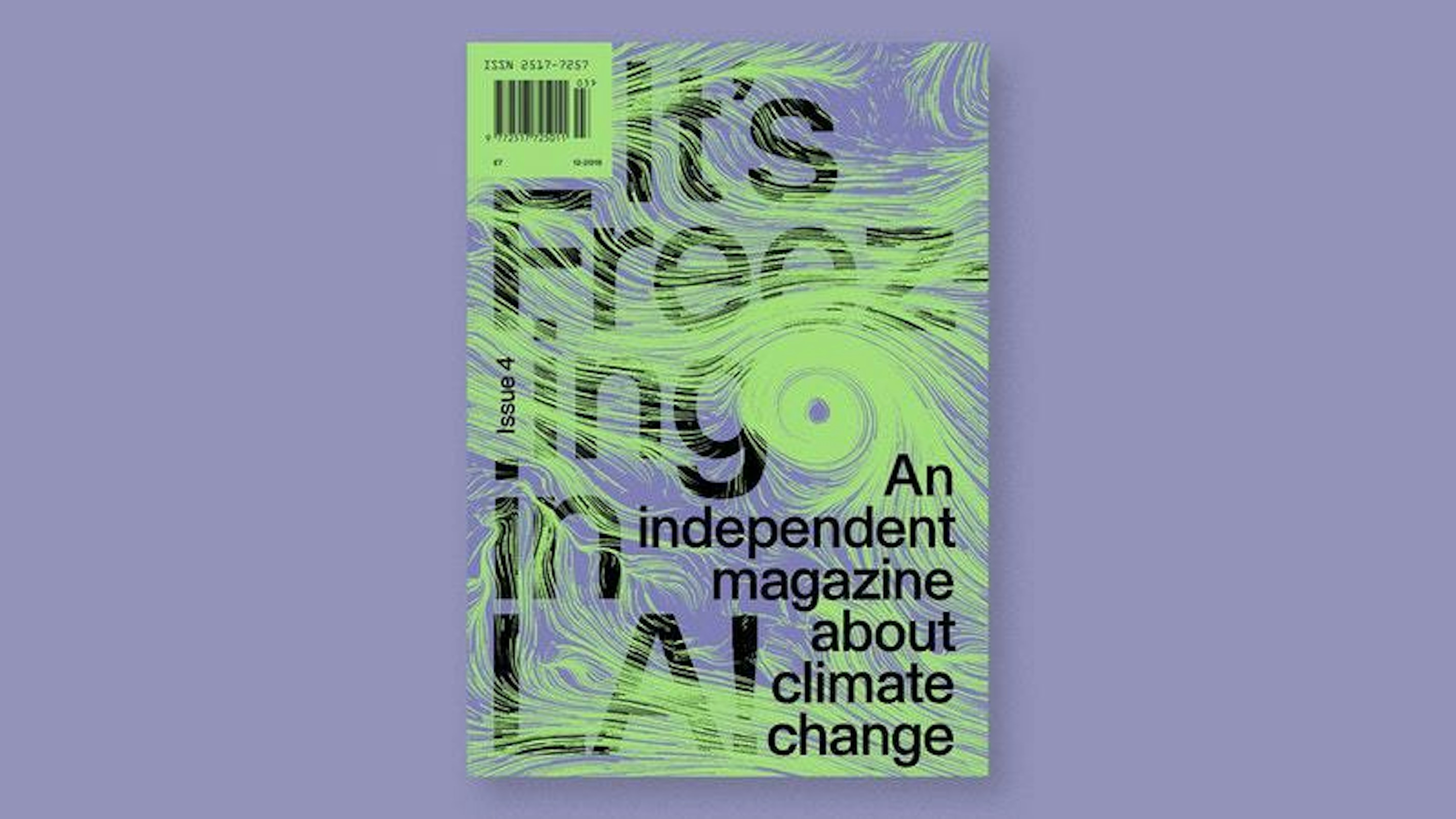
We also worked with illustrator Jack Sachs on the cover artwork. Varoom had a list of possible illustrators for the cover, but we felt his style and humour would engage and intrigue from the offset. Jack supplied a handful of sketches in response to the ‘storytelling’ theme and – after we had chosen one – there were a few rounds of amends, before the cover was finally finished.


Delivery
For the printing, we were keen to work with a company who cared about the job, wanted to be a part of creating a new era for Varoom and also worked within our budget. We researched companies together with Ren and Derek, and in the end we went with a printer we hadn’t worked with before. We dealt directly with them for the most part, requesting proofs and samples, and sending any queries we had along the way. Open design files were supplied and we used Epson scatter proofs to check colour, image detail and quality, as well as textured laminated running sheets for the cover and folded and gathered sheets before binding.
We were commissioned to design at least two issues of the magazine, so we haven’t handed over any style guides or tool kits yet. Our design is firm, but not set in stone. It will evolve with the next issue, so I think if we ever pass it over to another design team we would offer a loose list of the guidelines we worked to, but ultimately each designer is free to use their instincts, experience and knowledge to shape it.


Spreads from the final design

Spreads from the final design

Spreads from the final design
The reaction to the final outcome was very positive, and everyone we’ve spoken to is fond of the new design. The client seems happy, sales have increased and more stockists are taking it. We wanted to make something people would want to keep, so only time will tell in this instance. Every job has things you’d do differently; we’re pretty pleased with it, and most things we’d change are only small tweaks. If we’re still happy with it in a year’s time, then it’s a success!


Spreads from the latest issue of Varoom (2017)

Spreads from the latest issue of Varoom (2017)
Interview by Marianne Hanoun
Mention Joe Hales
Mention James Lunn
Mention Kia Tasbihgou
Mention Jack Sachs