Hot off the press! Why these students chose newsprint for their favourite projects
As we continue to spend more of our working lives online and in the digital world, there’s something to be said for the tactility that comes with a beautiful piece of print. Which is why, in collaboration with Newspaper Club, we’ve asked six students to share projects they’ve created that centre around this flexible medium. Featuring everything from a newspaper comprised entirely of digital comments, and a homage to the first African American character featured in Peanuts, to an ode to potato waffles – we find out how these projects celebrate the versatility and accessibility of newsprint.

An Ode to Potato Waffles

An Ode to Potato Waffles
A university passion project paying homage to a carb-filled snack
Beth Wilson
An Ode To Potato Waffles was created as a university passion project, with the sole aim to praise the under-appreciated waffly, carby goodness that is potato waffles. Intended to highlight all redeeming qualities of the waffle, the lighthearted zine features waffling copy, plus a layout grid and typeface based on the grid of a potato waffle.
I chose newsprint as I love the textured nature of the material, but also because it neatly represented the cheap and cheerful nature of potato waffles and seemed like the perfect pairing. It even brought on the connotation of chip shop paper which enhances the cheap and cheerful ‘greasy potato’ image even further.
Newsprint is by far my favourite medium, as the texture really brings out the designs and creates a nice effect. The style also brings a ‘work in progress’, hot-off-the-press feel to it, taking pride in its texture imperfections, which makes it perfect for zine editorials. Also, the grey tinge softens the colours and harsh white of normal paper making it a totally different printing experience.

Adam's portfolio

Adam's portfolio

Adam's portfolio

Adam's portfolio
A tangible, foldable portfolio
Adam Breckons
I was in my final year of studying graphic design at university and as a soon-to-be-graduate, I felt that it was the perfect time to update my portfolio.
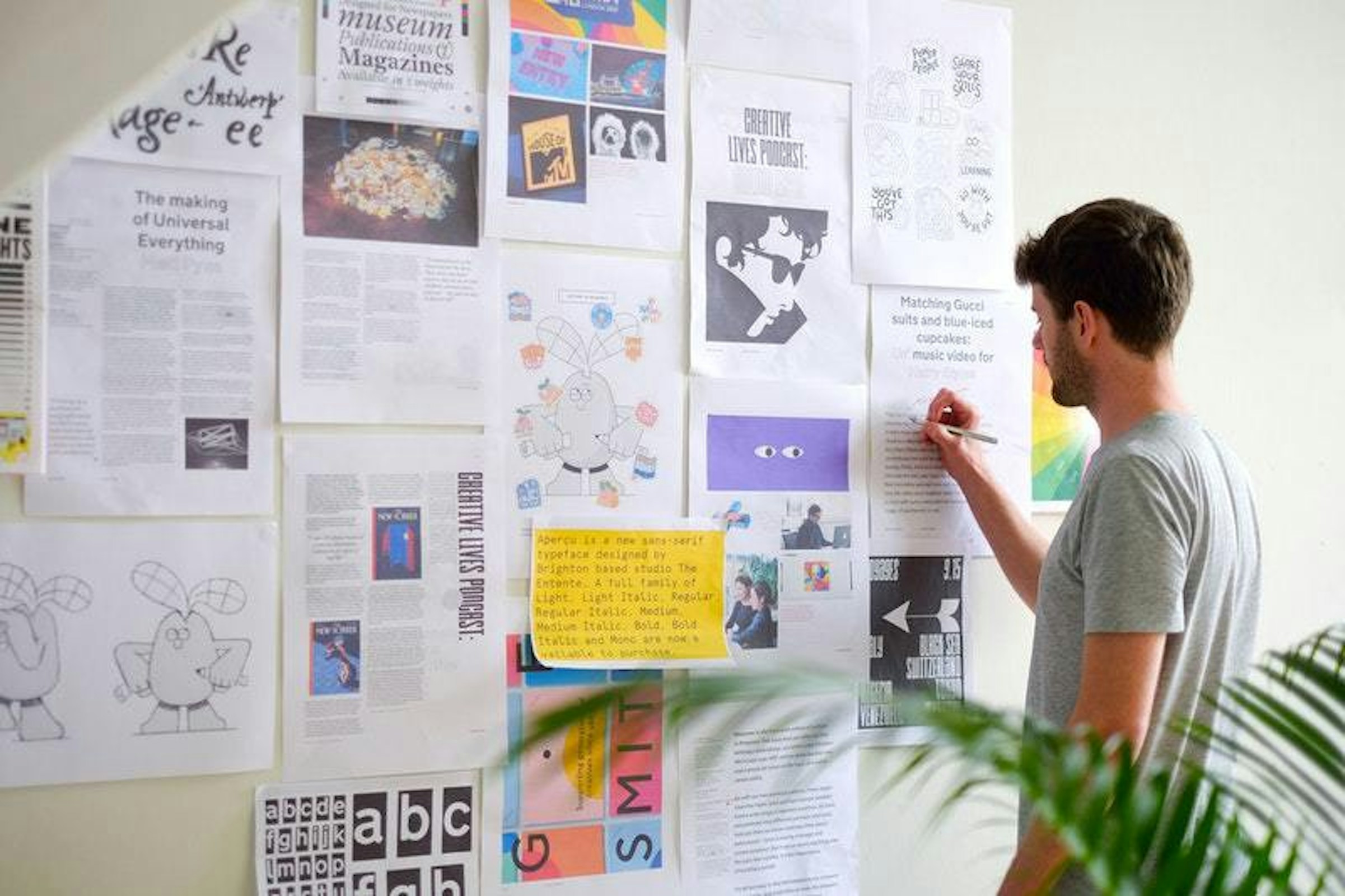
I try and strike a balance between both form and function; something that is aesthetically pleasing but also informative. Which is why a newspaper seemed like the perfect fit for me: it’s a ubiquitous form of communication and also allowed me to exhibit my editorial skills. Many designers use their website as a portfolio, which is fine, but this can lack the tangible and interactive qualities provided by a newspaper – and unlike websites, newspapers have been around for hundreds of years so are probably here to stay!
The pages are also quite thin so, even with a lot of pages, you can still produce quite a compact, light and (if needed) foldable document. A newspaper is also physical which means you can leave one behind after an interview for others to see and interact with. A newspaper is more complete and unified when compared to individual pieces of paper, which is how I used to present my work.

The Courage of Franklin

The Courage of Franklin

The Courage of Franklin

The Courage of Franklin
A dissertation all about Franklin, Peanuts’ first African American character
Bethany Galley
The Courage of Franklin was my dissertation while studying Communication Design at Gray’s School of Art, Aberdeen. The piece tells the story of Franklin Armstrong – the first African-American character to be included in an American comic strip.
Charles M. Schulz’s Peanuts was one of the most adored and well-read comic strips of its time and the introduction of Franklin in 1968, a time of racial segregation in America, is still seen as revolutionary today. Although it was Schulz’s decision to include Franklin within the strip, it was actually Harriet Glickman, a housewife from Los Angeles, who was the driving force behind this, writing to Schulz on numerous occasions to put her idea forward. During the process I was in frequent contact with Glickman who I am now going to visit in Los Angeles next month.
“Franklin was first introduced in a newspaper, so I couldn’t have thought of a better way to present my dissertation.”
Franklin was first introduced in a newspaper, so I couldn’t have thought of a better way to present my dissertation. A lot of the images of the comic strips are in black and white so they look like the originals that were printed back in 1969. We are now in a time where not much is printed on newsprint, so everyone was really surprised when they first saw my dissertation – the medium makes it stand out.

The Daily Feed

The Daily Feed

The Daily Feed

The Daily Feed
A graduation project celebrating Twitter
Edith Ault
The Daily Feed was my graduation project at Glasgow School of Art: a 40 page newspaper, created in celebration of Twitter, and its role in everyday news. Risograph prints inspired by Twitter headlines accompanied ‘articles’ composed of users’ tweets and comments. From Brexit to porridge, meerkats to Trump, the eclectic and unpredictable nature of these headlines invited users to contribute (consciously or otherwise) to a new form of journalism.
I would spend each day scrolling through my feed to generate quick responses from the news of day to develop into larger, more developed Risograph prints. I also exhibited the paper at my degree show, showcasing my primary responses, and gave a thorough narrative of the years’ news from my own perspective.
“I really love newsprint for its flexibility, texture and accessibility.”
On Twitter, anyone can instantly respond to an article, often without even reading it – whereas the selection of comments from readers published in newspapers could never truly represent the speed, diversity, and often danger of interaction that social media provides. I really love newsprint for its flexibility, texture and accessibility; and wanted to create something that took inspiration from both traditional news outlets and modern ones.
I wanted The Daily Feed to explore and celebrate how different the two really are by creating something that would never normally exist in traditional press: a newspaper created from digital comments, curated through a multiverse of perspectives.

Folding Bikes Only

Folding Bikes Only

Folding Bikes Only
A dissertation protest in support of public spaces
Ben Kite
Folding Bikes Only was a response to the privatisation of public space, with a focus on the development at King’s Cross. The commodification of public spaces is a threat to the democratic health of our cities. From criminalising fundamental human rights such as protesting, to pushing out the homeless from the only places they can represent themselves, privately owned public spaces threaten the health of our cities in a huge way.
Alongside a series of guerrilla public space interventions, I wrote an article that explored the motivations behind the project, the fundamental issues apparent in these spaces and how the designer can create change through public interventions and protest art. I created a fictional protest group, with myself as the spokesperson, who were producing work that aimed to tackle and highlight the issues in these spaces.
“The newspaper format felt authentic, and added another layer of realism to the project.”
For my degree show, I wanted visitors to be able to take away a part of my project, and to raise awareness of the problems. I wrote the article, and felt that the newspaper format was the best way to communicate it – it felt authentic, and added another layer of realism to the project.
As a student, the task of printing 100 copies of something to give away for free was quite challenging, so I did a little ‘hack’ on the Newspaper Club’s formatting and printed two pages on each page. When the newspapers came, all I had to do was slice them in half down the ‘endorse fold’ and voila! – eight page newspaper from a four page print.

A hot-off-the-press print for the runway
Andrew Groves, course director, BA Fashion Design, Westminster University
We made a newspaper for the A/W19 collections from our runway show at London Fashion Week in February. We showed a selection of our final year BA Fashion Design students’ collections on the official LFW schedule, our second year running.
We use newsprint for it immediacy, it still has that hot-off the presses feel to it, it makes you feel that what’s inside has only just happened and is of such importance that we needed to printed in the quickest way possible.
So for fashion and runway it seems perfect. The classic grid-like formula helps to underline the differences between each designer and collection. We also send it out to press, and took it to Paris where we held our first ever showroom; it was the perfect way for visitors to look at the collections and see their details at the same time.
...
Lecture in Progress members can get 20% off when printing a newspaper with Newspaper Club. Head to the Offers and Promotions page to find out more.
Mention Edith Ault
Mention Bethany Galley
Mention Adam Breckons
Mention Beth Wilson
Mention Ben Kite
Written by Anoushka Khandwala
Interview by Marianne Hanoun