Dapo Adeola on illustrating his co-created, Penguin-signed children’s book ‘Look Up!’
In 2015, writer and actor Nathan Bryon approached friend, collaborator and illustrator Dapo Adeola with an idea for a children’s book. As a specialist in character design, Dapo brought Nathan’s vision of Rocket – a curious young black girl with big hair and an even bigger love for space – to life, turning a topic more typically associated with white, male characters on its head. After hashing out a first draft and meeting with an agent, the pair were soon (and quite overwhelmingly) inundated with offers from major publishing houses. By mid-2017 they were signing a three-book deal with Penguin Random House – an incredible feat considering that this was their first project of this kind. With the book set for release this summer, Dapo charts his inspirations and learnings on everything from background art to planning and timing, as a newbie to the picture-book world.

Project Background
Nathan Bryon and I have known each other since 2010. He approached me to do some character design work for a project he was putting together back then, and we’ve followed each other’s work ever since. Then in 2015, he approached me again, this time with an idea for a kids’ book character. His brief was to design a little black girl who’s obsessed with space and has BIG hair. So I went away and did my thing, and came up with the design and look for our book’s character.
Nathan, already being a credited actor and talented screenwriter, was signed to an agency which had just merged with a literary agency who took an interest in our little project, and requested to meet me. I came in and signed with them and we put together a pitch, which our agent took out to the Bologna Children’s Book Fair…and from there everything went bananas. The following couple of months saw us being flooded with offers from over 14 massive publishers, who all wanted to take this book on. After the dust settled we chose Penguin Random House, and then began our storytelling journey in earnest.
“Everything went bananas. [We were] flooded with offers from over 14 massive publishers.”


Coming Up With a Concept
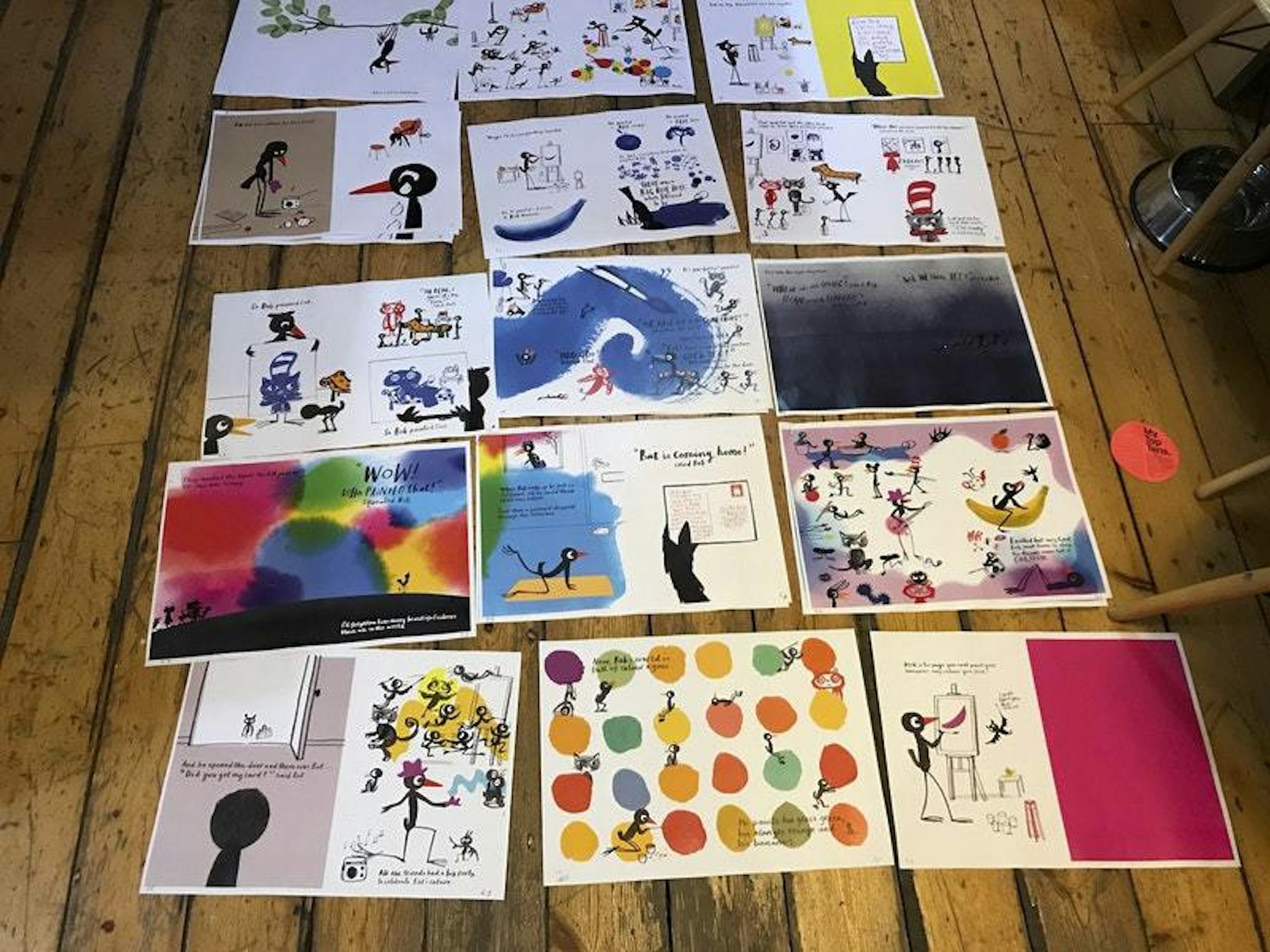
This was my first-ever picture book, and I felt like I was in way over my head at the beginning, but luckily I had a team on hand to help me get to grips with it. Once I got the layout template, courtesy of the designer on the project, it was just a case of figuring out my compositions in a way that helped the pace of the story flow smoothly.
I used the work of classic picture-book artists like Martin and Alice Provensen, Lowell Hess and J.P Miller as a guide for the style of the book, as well as modern picture-book artists like Marc Boutavant – and I tried to capture a similar energy.
I decided it was best to play to my strengths as a character designer, and focus on coming up with compositions for the spreads. I focused on our character and allowed her to lead the narrative instead of trying to tackle environments, which is something I’m not yet strong at.

As this is a character-driven book, it was important that our lead character have enough personality to hold a reader’s interest. This is my favourite part of the process. I start by going online and compiling a mood board of images that inform the look, vibe and energy of the character I’m designing. To be perfectly honest, this particular character wasn’t actually initially designed with inclusivity in mind – at least not in the early stages. That aspect of the character was a sort of by default.
I based Rocket’s energy and mannerisms on one of my nieces. She had to be bold, brave, curious and confident – all in a serious manner, while also being capable of being silly and playful when she’s ready. These traits were the important things that needed to come across, rather than the fact that she’s a young black girl in a genre of books (about space), which is typically reserved for young (predominantly white) boys.

The appeal of the characters I design tends to be in their personality, rather than their appearance. This, to me, is the most important part of creating character-driven narratives. If you can create a well-informed and fleshed-out character in terms of personality, then it’s just a case of slotting them into a story of your choice, and basing your narrative on how they’d react in that scenario. So basically, a well-designed and fleshed out character can be put into near enough any situation.
When it came to her appearance, the orange jumpsuit was an inspired choice. I wanted to choose a colour and outfit that was gender neutral. This was the first one I tried, and it just stuck. As for tackling the spreads themselves, I began by laying out my pencil roughs first, and broke the book up into character-heavy spreads and those that required more in the way of a location. After finalising the book in rough pencil form, I then moved onto the digital clean-up stage. This was the most difficult stage as it involved colour, and I found that a few of the spreads I’d roughed up were in need of improvement.
“I based Rocket’s energy and mannerisms on one of my nieces. She had to be bold, brave, curious and confident.”


Development and Production
The development and production mostly consisted of a back-and-forth between myself, the designer on the book and the editor. All my draft work was done using pencil and paper on my light box with the occasional touch-up using my iPad and the Procreate app, and then the clean colour work was done via Photoshop, working on top of the scanned draft images.
I’d carry out my draft work on a few spreads at a time, and send them through for feedback and notes from the designer and editor. Once I got the notes, I’d make the necessary tweaks before going through to the colour stage and finishing the image. There was no set time and date for this, but I’d try and set things up so we’d go through this process at least once a week (every Monday), which gave me seven days to work on a spread and make the changes necessary to an image.

Once we’d managed to get all the spreads from draft to colour, the Penguin team would take the work to the office for feedback from the rest of the staff. They also got feedback from teams in the other countries where the book will be released, before it was sent back to me to make any major changes. After this last round of edits, the book was as good as it could be, and it was declared officially finished and ready to send to the printers!
I was quite fortunate in that there was rarely a massive change that needed to be made each time I received feedback, this was in part due to the amount of work I did to solve the problems I saw before sending the work off to the team for notes.
“A well-designed and fleshed out character can be put into near enough any situation.”


On this particular book I was working with a text that was slightly open to change, depending on how well it flowed with the artwork and vice versa. This meant that the test and the artwork pretty much developed together, which was a relief as it gave me room to flex.
As this was my first-ever book, one of the hardest things was allocating a structured time limit to be able to get the work done. Partially due to this, and the amount of things I was learning on the job, we ended up going way over the proposed deadline (about five months over). This is not the norm, and I learnt a lot about time management during this experience! I was very lucky to have a team who were so supportive and understanding, and we definitely got the best possible book out of it.


On Reflection
The hardest part of the process was working out the backgrounds and environments. If could do it again I’d have practiced working on these elements a bit more before tackling the book. That being said though, the feedback has been very positive across the board, with people even commenting on the background and environment design as their favourite elements in some cases!
Overall I think the project was a success, for my first picture book it definitely does the job. I think for the upcoming two books it can only improve, and I look forward to fleshing out more of this world and bringing life to them all.


Interview by Marianne Hanoun
Mention Dapo Adeola
Mention Penguin Random House
Mention Nathan Bryon